Content
Why the Next Notis Website Has to Explain a Much Bigger Product
Most startup websites become outdated long before the product does. Not because the colors are wrong or the hero section feels old, but because the company quietly outgrows the story it is telling.
That is where we are with Notis.
When we first put the site together, the goal was simple: explain the product fast, make it feel alive, and help people understand that this wasn’t just another chatbot wrapped in productivity language. That framing got us pretty far. But over the last months, Notis has been stretching into something much broader, and the website now needs to catch up with reality.
This is not a cosmetic redesign. It is a translation problem.
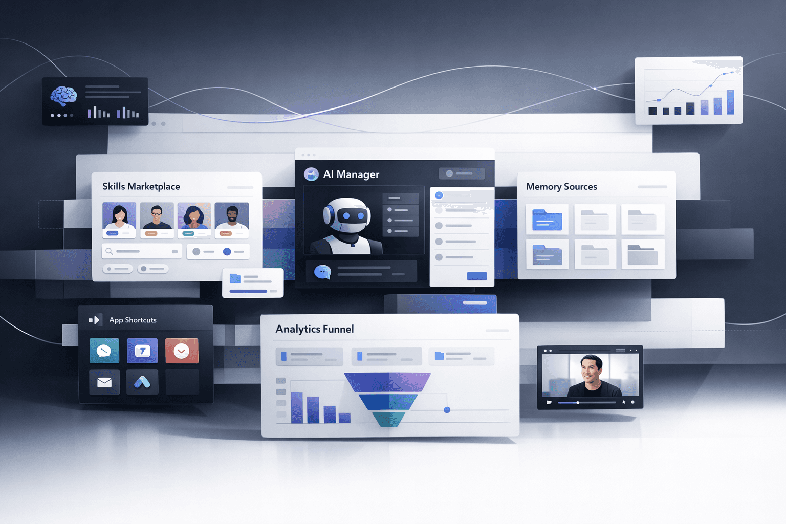
The product is no longer one surface. It is becoming a system. There is the manager layer. There are skills, and eventually a skill store with massive breadth. There are memory sources that make the system more context-aware over time. There are apps. There is the desktop experience. There are local workflows, shell-level actions, and shortcuts that make Notis feel less like a tab you open and more like infrastructure for how you work.
When a product expands like that, the worst thing you can do is keep using a website designed for a smaller idea. You end up flattening something powerful into a message that feels generic. You sound simpler, but in the bad way. Clearer on the surface, fuzzier underneath.
That is why we have been revisiting the Notis website from first principles.
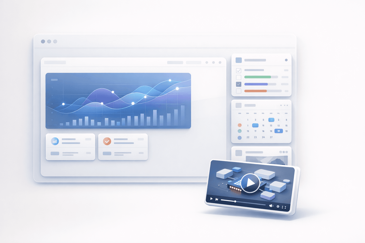
Some parts are already directionally right and should stay. The graph animation still communicates motion and intelligence in a way that feels native to the product. The vertical widget layout still gives us a strong way to present workflows without collapsing everything into feature soup. But other parts need to evolve. The oversized hero video, for example, asks for too much attention too early. It should probably become a smaller movable widget, something that supports the story instead of swallowing it. The structure of the page also needs a better rhythm. Clearer section titles, better transitions, and sharper pacing can do a lot of work when the product itself is becoming more ambitious.
This matters because product complexity is not inherently bad. Confusing product complexity is bad.
I think many AI products are about to run into the same wall. In the beginning, you can get away with a broad promise. Save time. Think faster. Automate work. Those messages are useful when the product is still earning the right to be specific. But eventually, if the product keeps shipping, the website has to grow from slogan to map. It has to show people where they are, what the system can do for them, and how all the pieces fit together.
That is the challenge in front of us with Notis.
The next version of the website needs to explain a much bigger product without making it feel heavier. It needs to show breadth without creating noise. It needs to make the product feel more capable and more obvious at the same time.
That tension is also changing how I think about landing pages.
For a while, a lot of SaaS websites operated with one core assumption: build one homepage that tries to speak to everyone, then optimize it forever. I think that model breaks down once your product becomes flexible enough to create value in very different ways for different people.
Notis is getting there.
A digital marketer does not need the same story as a sales team. A founder building their personal operating system does not evaluate the product the same way as a team trying to automate internal workflows. Even if the underlying platform is the same, the entry point should not be. The examples should not be. The promises should not be. The friction should not be.
That is why I am increasingly convinced that the future website is not one site with one message. It is a structured set of ICP-specific landing pages built on top of the same product truth.
Notis for digital marketers should feel like it was written for digital marketers. Notis for sales teams should feel like it understands pipeline, follow-up, CRM hygiene, and speed. The mistake is not in being specific. The mistake is in pretending specificity makes the product smaller. In reality, it makes the value easier to see.

The interesting part is that this is not only a messaging exercise. It is also a measurement exercise.
Once you start building pages for specific ICPs, you can no longer judge the website only on whether it looks good or whether people spend time on it. You have to look at the full chain. What happens at the ad level? What promise got the click? What happens on the landing page? What framing gets the conversion? What happens in onboarding? Does the product deliver on the expectation that the page created? And what happens after that? Do people actually use the product in a way that confirms we attracted the right user in the first place?
That full-funnel view is where I think a lot of website work becomes strategic rather than decorative.
A landing page is not just content. It is a hypothesis. It is your public guess about who the product is for, what they care about, and what kind of transformation they want. If the guess is good, the rest of the funnel gets easier. If the guess is vague, the rest of the funnel is forced to compensate.
This is also why I care so much about the structure and modularity of the site right now. The website has to support a product that keeps expanding. Notis Manager, the skills ecosystem, memory sources, apps, desktop features, local shell access, system-wide shortcuts, all of these things increase the product surface area. That is exciting, but it creates a communication tax. If the site is rigid, every new capability makes the whole thing harder to explain. If the site is modular, every new capability becomes another block you can place in the right narrative for the right audience.
In other words, the website needs to become a system too.
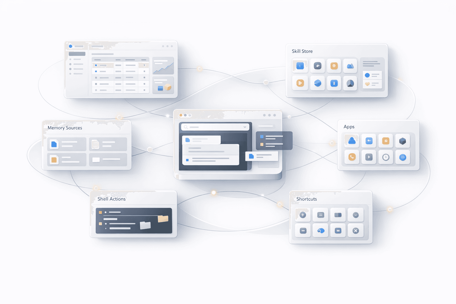
I do not think the answer is to throw everything onto the page and hope users sort it out. The answer is better sequencing. Better hierarchy. Better storytelling. A clearer sense of what has to be understood first and what can be revealed later.
That is why details like section rhythm matter more than they seem to. That is why a card-grid alternative is worth testing. That is why shrinking the hero video can actually improve comprehension. These are not isolated design tweaks. They are decisions about cognitive load. They shape whether the product feels intuitive or overwhelming.
For me, the real test of the next Notis website is simple. Someone should land on it and immediately feel that the product is ambitious, but not confusing. Powerful, but not bloated. Broad, but still legible. They should understand that Notis is no longer a single feature wrapped in AI branding. It is becoming a serious work layer, and the site should make that feel inevitable.
That is the standard we are designing toward now.
Because the job of the website is not just to make Notis look good. It is to make a much bigger product feel obvious.

Flo is the founder of Mind the Flo, an Agentic Studio specialized into messaging and voice agents.